Panel Loading
Conditionals
Additional functions (Free)
Additional functions (Pro)
On this page hopefully, we will help you with all the questions you may have with the MaxBoxy plugin and how to add floating WordPress content or inject it into any page.
Installation
Pro version works as an add-on over the basic plugin. So, in any way you have to install the basic (free) version.
Basic version (Automated Installation)
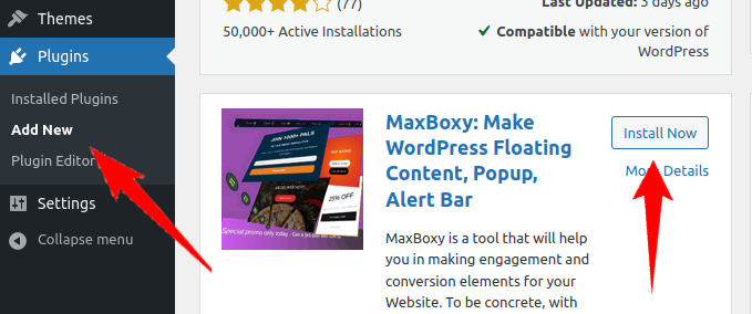
From your WordPress dashboard, navigate to the Plugins -> Add New, then search for the “MaxBoxy”. Install a plugin and then you’ll be prompted with a new button to activate the plugin.
Premium version installation
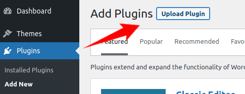
Download the purchased plugin. Go to the “Plugins” section of your WordPress admin dashboard. Click on the “Add new” and choose the “Upload plugin” button. Select the downloaded zip folder for upload.
Manual Alternative
Alternatively, install the plugin by uploading the files manually to your server. This is for developers and those comfortable working in such environments:
- Download the plugin
- Then, upload the extracted files to the plugin directory of your WordPress installation
Activate the plugin(s)
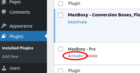
Now, go to the dashboard of your site and visit the Plugins section. Activate MaxBoxy Pro. If not already done, activate the basic plugin as well.
Global settings
Navigate to the MaxBoxy -> Settings. From this section, obviously, you can determine the common settings, i.e. those you would like to act as default. Later, from each created panel, you can override options for the particular item.
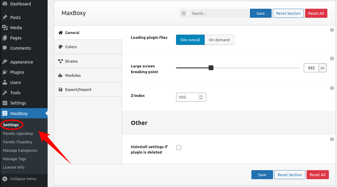
These settings should be self explanatory from their titles and the most of them have further explanation accessible by hovering a mouse over a question mark in each option’s top-right corner.
Panel Strains
FloatAny
With FloatAny create floating site panels
InjectAny
With InjectAny embed content in specific site locations
Synced Patterns
Synced Patterns, a.k.a. “Reusable blocks” is a native WordPress feature that we extend with MaxBoxy options so you can embed it anywhere on your site
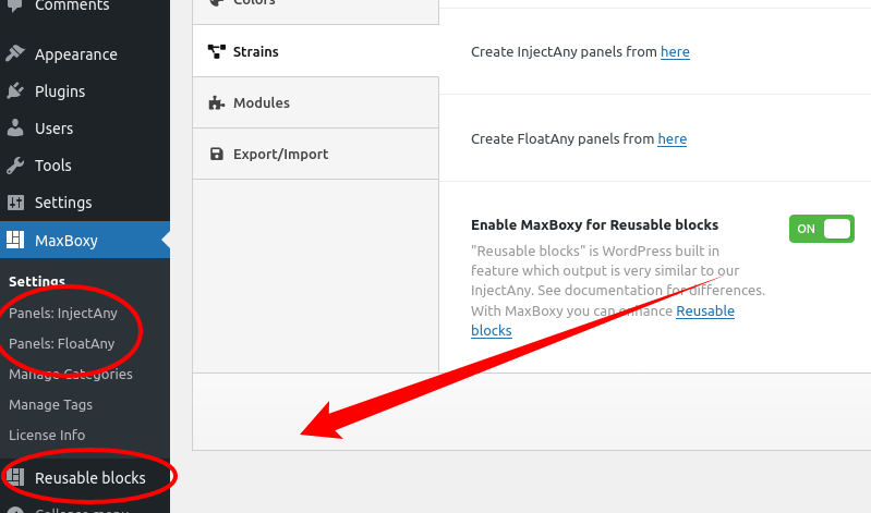
You see, “Reusable blocks” is a bit hidden feature available in WordPress core. If you enable this as a strain from MaxBoxy settings (as seen on the screenshot) we bring it upfront and you can access it from the admin sidebar’s menu. Basically, it’s very similar to what our InjectAny can do with shortcode output, but since it’s native in WordPress seems better to extend it with MaxBoxy options while limiting the InjectAny panels just to certain locations by default. Still, you can output with InjectAny shortcode in any location or use Reusable blocks with MaxBoxy options to complete the same thing.
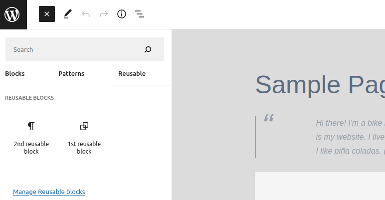
The main difference from the InjectAny is that with “Reusable blocks” you do not have loading locations. Instead, you use WordPress’ core block interface to embed these previously saved swatches. Once you publish the first Reusable block, the 3rd column “Reusable” appears in the block inserter interface representing this option.
Enable modules
Dependent on what you wish to use, you can enable/disable modules, accessible from Maxboxy -> Settings -> (tab) Modules.
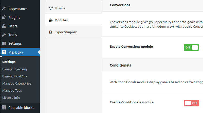
Available modules:
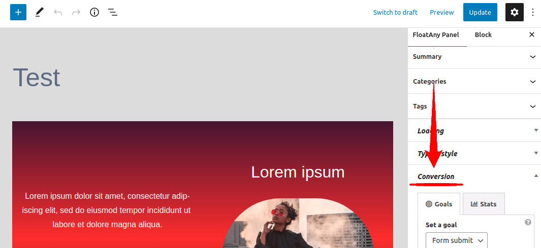
- Conversions – options dependent on this module are like banish panel, loads count, views count, goals complete. Basically any panel’s feature, that is dependent on the browser’s local storage API (which is a feature similar to Cookies, but in a bit modern way), will require Conversions module to be active
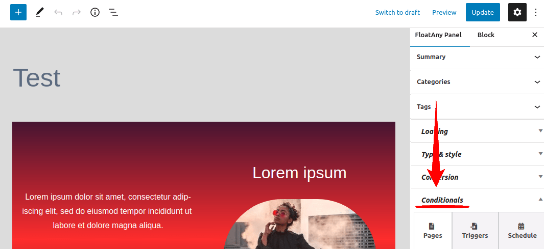
- Conditionals – enable this module to be able to set a specific condition to reveal the panel
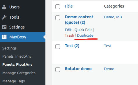
- Duplicator – allows you to copy each panel and develop it as a separate instance by applying additional changes. Access the Duplicator option from the panel listings, e.g. Dashboard -> MaxBoxy -> Panels FloatAny. By hovering over each panel item you’ll be able to notice the “Duplicator” option
License
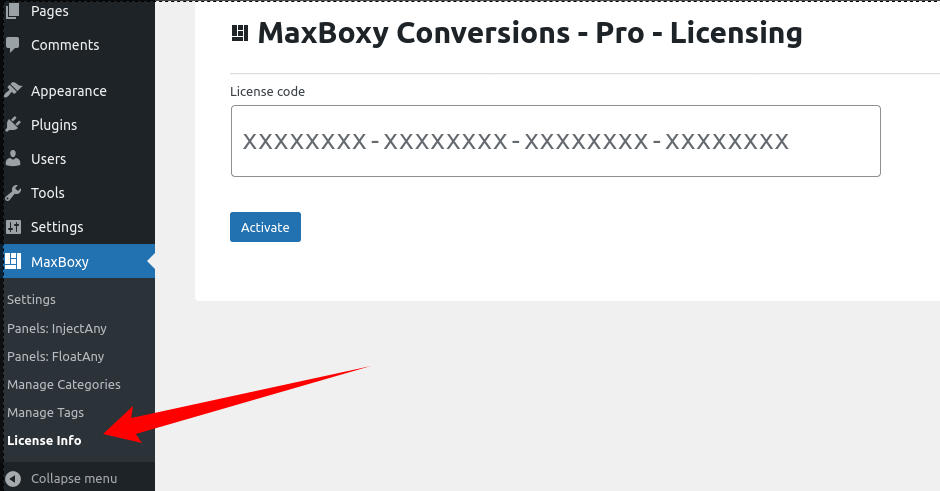
To activate the license for your MaxBoxy Pro plugin, select the “License Info” menu item from the MaxBoxy sidebar menu.
Create a panel
No matter if you are publishing FloatAny, InjectAny or “Reusable blocks” the process is the same. In the WordPress admin area go to the Panels section of either FloatAny, InjectAny or “Synced Patterns”. There you can start by clicking on the button “Add new”.
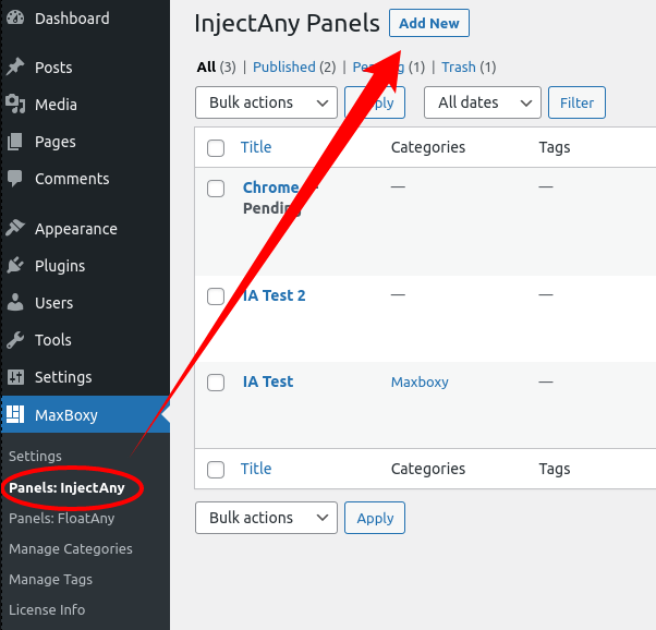
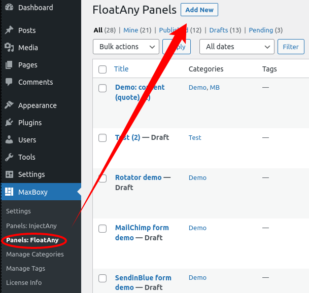
In the panel’s post area, you should add content and adjust the panel’s settings.
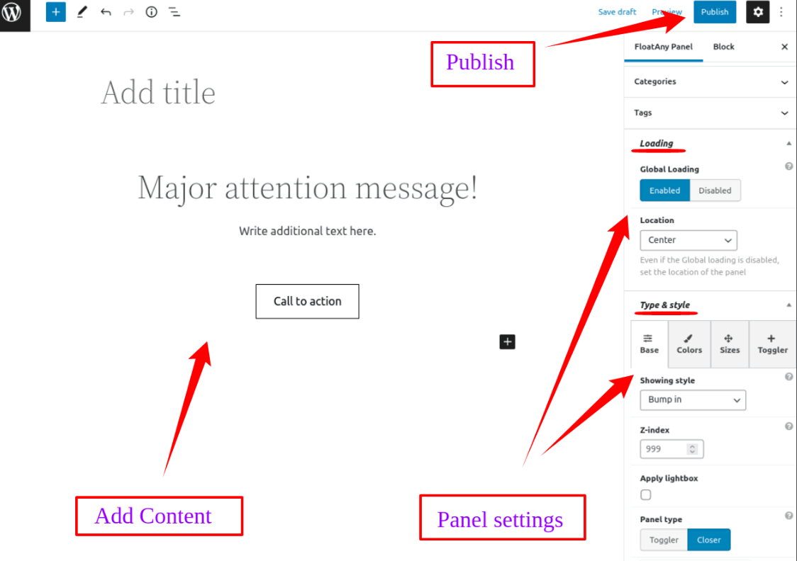
What ever you add as a content will appear in the panel. After you have added the content, simply hit the “Publish” button just like with the regular WordPress’ post.
You see, what you create here can be a common menu, info bar, call to action message, newsletter popup panel, etc.
Publish a panel
With the basic MaxBoxy version all the panels are loaded instantly over the whole site. On the other hand with the plugin’s Pro version there are other options, so let’s explore them.
1. Site Global Loading – enabled is the default behavior and the only conduct with the free version of the plugin, while with the MaxBoxy Pro version you can disable this option which gives you the opportunity to use other displaying options and to load the FloatAny or InjectAny panel on a single page or on a template
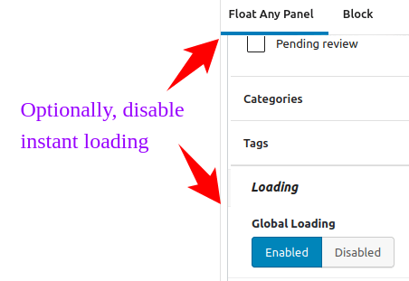
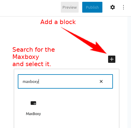
2. WordPress editor (Block) – While editing a post/page, use the WordPress’ “block interface” and search for the “MaxBoxy”. After selecting the block and required panel, it will generate the shortode serving all the settings you have already set for the specific FloatAny or InjectAny panel
3. Shortcode – use the shortcode floatany id="" or injectany id="" to insert the panel even outside WordPress’ block interface. Just make sure to encompass it with square brackets – that way WordPress knows it’s a shortcode


4. Embed “Reusable blocks” – The main difference from the InjectAny is that with “Reusable blocks” you do not have loading locations. Instead, you use WordPress’ core block inserter interface to embed these previously saved swatches. Once you publish the first Reusable block, the 3rd column “Reusable” appears in the block interface representing these.
Loading Settings
When publishing a panel, among the first things set loading options and where is it loading.
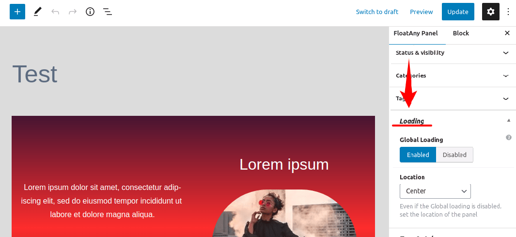
Available options:
- Global loading – Pro version enables you to toggle between the Enabled/Disabled. If disabled you can invoke the panel with a shortcode on a single page or in a template
- Location – where to load
- For FloatAny panels set in which part of the browser the panel will be shown: left topped, left centered, left bottomed, center topped, center, center bottomed, right topped, right centered, right bottomed.
- With InjectAny embed the content in:
- Head – in page’s <head> element. This option is for embedding styles and scripts e.g. Facebook Pixel or Google Analytics code. You can use only HTML block with this location and use the code that is encompassed with <style>, <link> or <script> tags. Actually any inappropriate code for the <head> element will be stripped away before the output. Though it is also possible to do so with the next option i.e. “Top” of the body, if really necessary you can utilize the Head option. With head option not all conditionals are available, still you can utilize per page or even schedule conditional options
- Top – on top of the page’s <body> tag
- Bottom – on bottom of the page’s <body> tag
- Test mode – Panel will be loaded for the admin users with at least privilege of site’s Editor. If this option is checked panel won’t be visible to other visitors.
Type & style settings
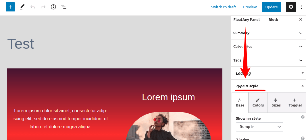
The simple interface guides you to complete the FloatAny panel’s settings. Reach all the basic options through the framed tabs. We’ll explore one by one.
Type & style > tab: Base
Set the most basic and maybe the most important options at the same time.
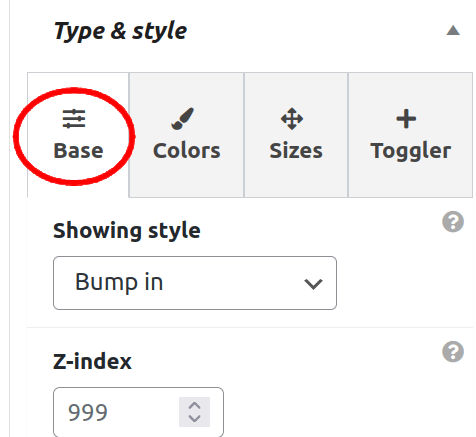
Available options:
- Showing style – adjust in which way the panel is revealed on the site. Options:
- Bump in (default with FloatAny) – The panel appears abruptly
- Fade in – The panel is shown slowly by fading in
- Slide in horizontally – On its appearance, the panel is transitioned from aside to its location
- Slide in vertically – On its appearance, the panel is transitioned from the browser’s top/bottom edge to its location
- On page load (With InjectAny default) – This is useful if you want your panel loaded immediately without any effects or maybe you are using it to publish some code like CSS, JS
- Align wide (With injectAny) – When in view-port panel will expand approximately to the content edges …Still, this option depends on the theme usage and require the theme that is applying “alignwide” class
- Align full (With injectAny) – When in view-port panel will expand to th browser’s full width …Still, this option depends on the theme usage and require the theme that is applying “alignfull” class
- Set as Sticky (With injectAny) – When the page is scrolled down it sticks on the browser pane’s top edge. Still worth mentioning, this option is relevant to the parent element’s container and since its stickiness is applied for the parent element. This means that if you put the panel in the WordPress’ group block, it will be sticky to the end of that group block. Putting a panel as the top level block inside the content area, while scrolling, will stick it on top of the content as long as you scroll to the end of the content area
- Alignment (With InjectAny) – If the panel’s size is set but not with 100% width, you can align its postion
- Z-index – determine the stacking order of the panel considering other elements on the site. Useful if something is overlapping the panel, simply give it higher z-index to override other elements
- Apply lightbox – a lightbox manner will be shown behind the panel
- Panel type – Basically, set the way the panel is opened and closed. Options:
- Toggler – Panel comes along with the toggle-button, which allows revealing and hiding a panel, while the toggle-button always stays visible
- Closer – A panel can be closed with a click on the button which appears along or inside the panel
- Panel roles – set additional behavior for the panel. Options:
- Hidden (with Closer type) – The panel won’t be visible on the page’s load, you have to trigger it with a button (Pro version) or use it in combination with the next option – Exiter
- Exiter (with Closer type) – The panel will be shown once the user’s mouse approaches its browser’s address bar or tab’s closing button
- Banish (with Closer type) – Once the panel is dismissed, it won’t be shown again until the user clears its browser’s cache. Useful for the Cookies notice or similar
- Hover out (with Closer type) – closes the panel by moving the mouse out of it. First the mouse’s pointer has to enter the panel and once it’s out, the panel will be closed
- Label mark for closing – this is the sub-option of the Closer (on hover out), means that closing label (“Move out to close”) will be added once the mouse pointer enters the panel
- Rotator (with Toggler and Closer type) – works as a notification system by rotating the top level items inside the panel. You can set unlimited items and all items you set one beneath each previous as a top item, no matter is it a group block, gallery block or a simple paragraph block, will be considered as a notification item.
- Note 1: There’s one exception to the top level item rotation rule, or more precisely an addition. You can parse the query block, e.g. “latest posts”, to show each post item as a notification. This will also apply to Woocommerce blocks, e.g. “Best selling products” block. Actually it will work for any block that has a HTML structure “.some-block > ul > li“, e.g. “.wp-block-product-best-sellers > ul > li” or “.wp-block-query > ul > li” – all you have to do is add a class “mboxy-rotator-parentor” to the block you wish to parse, again Woocommerce’s “best selling products” block or core WordPress’ query block are excellent examples and they actually become “.wp-block-product-best-sellers.mboxy-rotator-parentor > ul > li” or “.wp-block-query.mboxy-rotator-parentor > ul > li”. If you aren’t a developer or a web designer, you do not need to know all these things regarding the HTML, you just need to know that the targeted block is a list. In essence, just add a class “mboxy-rotator-parentor” to the block (e.g. WordPress query block or Woocommerce block) you wish to parse. This marks the block as one that has children items to rotate
- Note 2: From the Conditionals -> Triggers restriction options tab, you cannot use scrolling events (Appear after event: Scroll) when the “Rotator” role is selected, it isn’t compatible
- Note 3: If you’re embedding some HTML, e.g. 3rd party form, using the core WordPress’ custom HTML block, usually it is the best to encompass the code within the div, e.g. <div class=”mydiv”>embed code</div>. This is to bypass some silly popup interfering by marking the embedded code as a whole, i.e. one notification item
- Rotation – on time – This is the Rotator’s subordinate option. Set how long each notification item will be kept as visible until switched by the next one (in seconds)
- Rotation – off time – This is Rotator’s subordinate option. The time between the two notification items (in seconds)
- Rotation – user’s closing pause – This is the Rotator’s subordinate option. Optionally, expend the “Rotation off time” if the Website visitor is closing the notification item (in seconds)
- Repeat rotation – This is the Rotator’s subordinate option. Set would the notification items will keep showing all over again in an endless circle. Default is disabled, i.e. the last notification item will close the rotation
- Igniter (with Toggler type) – similar to Toggler option, toggle-button will reveal and hide the panel. The difference is that, here with Igniter, the panel is initially closed
Advanced options (Pro version):
- Add classes – if you’re a developer, you may want to assign additional classes
Type & style > tab: Colors
Set the colors/backgrounds for the panel.
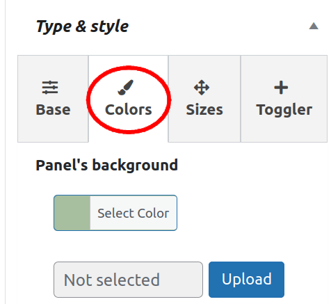
Color options:
- Panel’s background
- Panel’s text color
- Closer/toggler background
- Closer/toggler color
Type & style > tab: Sizes
Set the panel sizes and dimensions.
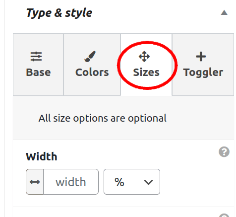
Sizes options:
- Width – Optionally, set the width of the panel in px, em, rem or %. If left empty the panel will take the content’s width
- 100% height – Set the panel to extend to the browser’s 100% in height, otherwise it will take content’s height
- Width (large screens) – Optionally, overwrite the width for the large screens
- 100% height (large screens) – Optionally, overwrite the height for the large screens
- Padding – increase, decrease or eliminate the spacing encompassing the panel. Default is 1.5em
- Border – set each border size, color and style
- Border radius – shape the panel’s corners by setting the size of the border radius
Type & style > tab: Toggler
Adjust the toggler/closer button options for the panel.
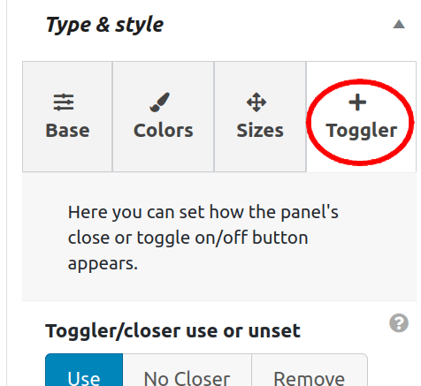
While in the Start tab you can define a “Panel type” which lays the role of the toggler/closer button, however, here you set the way the toggler/closer button is showing and its style.
Important: Options depend on the panel type selection, i.e. whether you choose Toggler or Closer from the Base tab.
Available options:
- Usage – should you use or remove the toggle button
- Use – the common default usage of the button
- No Closer (with Toggler type) – disable the closing aspect of the button. This should be done in order to use the in-content closing button, or, for example with the Igniter role if you wish to prevent the users from closing once the panel is open
- Remove – completely remove the default toggle/close button from the panel. This is useful if you want the panel to be always on screen or you wish to utilize the in-content closer button.
- Opener icon CSS/Opener SVG/Opener Image (with Toggler type) – A button that opens the panel. Choose among the CSS-formed hamburger, arrows, plus signs. If SVG is selected, it will override the CSS icon. When the image is uploaded, it will be used instead of SVG or CSS icon.
- Closer icon CSS/Closer SVG/Closer Image – icon of the button that closes the panel. Choose among the CSS-formed hamburger, arrows, minus signs. If SVG is selected, it will override the CSS icon. When the image is uploaded, it will be used instead of SVG or CSS icon.
- Size – set among the mini, small, normal, large, huge
- Position – it determines the position of the toggler/closer button relative to its adjacent content panel
- Toggler/closer style – additional styling options for the button. Chose among Squared, Rounded, Inside, Bordered
- Toggler additional message – this is the additional message that can be shown along the opener (igniter) button
- Margin – set the spacing for the opener (igniter) button
- Animation – apply the animation to the toggler button. Pick among Rotate, Shadow, Pulse, Shake Vertically, Shake Horizontally
- Animation appearance – the moment that triggers the animation. You can select one or combine them:
- Load – on page’s initial load
- Echo – repeat the animation until the toggler button is clicked
- Click – button click triggers the animation
- Echo pause interval – in seconds, specify the pause among the animation repetitions. This is the sub-option when the Echo is previously selected under the Animation appearance
Conversion

The purpose of the conversion is to trigger another action and to measure their accomplishment through the analytics. Lets explore the options.
Conversion > tab Goals
Set the goals for the panel
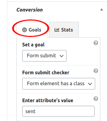
Available options:
- Set a goal – set the option you want to track
- Click – track clicks, e.g. on the call to action button
- Form submit – track form submission
- Do not show the panel again – by enabling this option, once the goal is met the panel won’t be shown to the same user, i.e. until its browser’s history-data is cleared
Conversion > tab Stats
Check the stats and conversion rate of the set goal
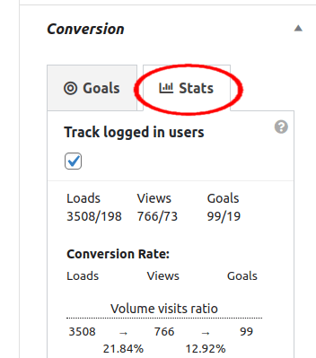
Available options:
- Track logged in users – By enabling this option Website’s contributors, i.e. Admins, Editors, or any user that has registered on the site and has a role like Customer, will be tracked in regards to the set goal
Conditionals

Panels can be shown conditionally based for particular pages, specific triggers, etc. We’ll explore those options bellow.
Conditionals > tab: Particular pages
With Premium version
Limit panel just for the particular pages (for a single page, multiple pages, post type, archive type, etc.).
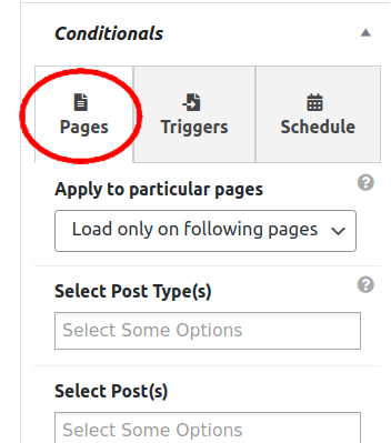
Available options (Pro version):
- Apply to particular pages
- Load only on following pages
- Exclude on following pages
Selection options:
- Post Type(s) e.g. Product
- Post(s)
- Page(s)
- Blog page
- Archive pages
- Particular categories
- Particular tag(s)
- By string in a URL’s path (RegEx)
Conditionals > tab: Triggers
With Premium version
Set the appearance campaign, i.e. show the panel based on the specific criteria.
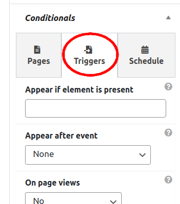
Trigger options (Pro version):
- Appear if element is present (value) – Only show the panel if the element is present on the page. You have to know the id or the class of the page’s element e.g. #header, #footer, #ad-1, .banner-1 etc. Still, enter just the value without the attr prefix “#” or “.”
- Appear if element is present (attr) – set is the target element a class or ID
- Appear after event – The panel will be revealed after specific event. Options:
- time – The panel will be shown on page’s load after specified time
- scrolling – The panel is revealed after the page is scrolled to the entered value (page’s position from the top in pixel, e.g. 400px)
- Element enters viewpoint – The panel is shown when the specified page’s element appears is in the browser’s viewpoint
- Beneath element’s viewpoint – The panel is shown after the determined page’s element falls out of the user’s viewpoint
- Repeat – For the options “Element in viewpoint” and “Beneath the element in viewpoint” you can set to repeat the behavior on the same trigger element, otherwise the feature will work just once
- Note: With “Element in viewpoint” and “Beneath the element in viewpoint” you have to set the id or the class of the page’s element e.g. #header, #footer, #ad-1.
- On page views – set the campaign for the new Website visitors:
- Until the (x) times – The panel will be shown until the site visitor has visited the specified number of pages. – i.e. for the first (x) page views.
- After the (x) times – The panel will be shown after the site visitor has visited the specified number of pages – i.e. after the (x) page views.
- User status – show the panel to “Logged in” or “Logged out” users
- User roles – show the panel for certain user role(s) e.g. Administrator, Author, Editor, Support Agent, etc.
- Appear for devices – determine whether to show the panel just for the mobile, desktop or all devices
- Appear by referrer – set the campaign by domain(s) or the particular URL(s), i.e. show the panel if a site visitor is coming from specified web addresses, e.g. google.com or facebook.com – make sure to include the “www” if the referrer is including this web address prefix
- Appear for country – name the country or countries you wish the panel to appear for
- Appear for city – This is the subordinate option of the “Appear for country”. You can narrow down the criteria to the city, just make sure that the stated city belongs to the specified country
- Important: The recognition of the country/city is received by utilizing the 3rd party API.
- There are two options, Hostip and Geoplugin. You can pick the one from these two from the plugin settings (your WordPress dashboard -> FloatAny -> Settings (Appear tab). Everything is communicated between your server and selected service, we do not collect any data. Which service you use is up to you, Hostip is free, while Geoplugin is free for certain usage volume, i.e. concrete geoPlugin is free within the limit of 120 lookups per minute. Your Website’s IP may be blocked if it is requesting more than this. You should look at their Website for more information if you are considering their premium services.
- While entering the country/city name, make sure you set the value as it is named with selected service (the same country can be named differently e.g. at Hostip, we have “SERBIA AND MONTENEGRO” while at the geoPlugin for the same IP it will read “Serbia”. Also for the city, for the same IP, Hostip displays “Beograd” i.e. in Serbian language, while geoPlugin uses English and displays “Belgrade”). Make sure you check from their Websites on how they are naming the country/city you are targeting.
Conditionals > tab: Schedule
With Premium version
Schedule the campaign, i.e. define the date and time span or either the starting point or ending point for the panel’s appearance.
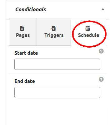
Schedule options (Pro version):
- Start date – Pick a day from the calendar
- Time (hour & minute)
- End date – Pick a day from the calendar
- Time (hour & minute)
- Apply to particular day(s) – Run a campaign just for the specific days or even limit to hours of the day, e.g. just in the evening hours. In order to limit the panel’s occurrence just for the certain day(s) in a week, multiple selections allowed, select from any day (Monday, Tuesday, Wednesday, Thursday, Friday, Saturday, Sunday)
Note: The time zone is set from the overall plugin options (Admin Dashboard > MaxBoxy > Settings > tab Modules)
Additional functions (free version)
Here are some options you can use additionally for the MaxBoxy panels, either FloatAny or InjectAny.
In-panel toggler/closer
To use the in-content buttons, just add a class to the element which is placed inside the panel. For example, this can be a button whose purpose is to close a panel instead of the default panel closer.
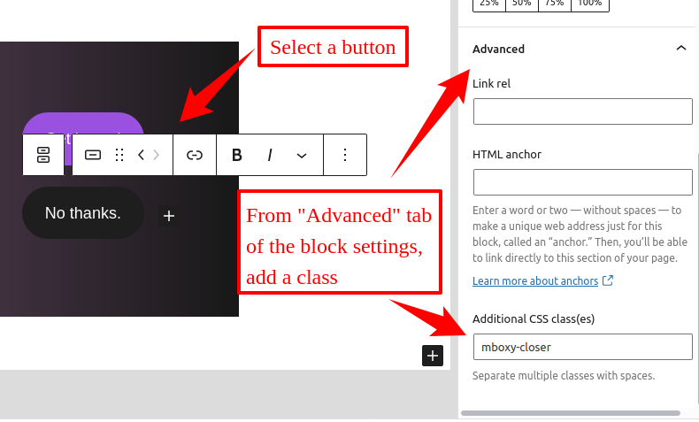
Available options:
- mboxy-closer – closes the panel. Recommended use is with the “Closer” panel type
- mboxy-toggler – toggles the panel. Recommended use is with the “Toggler” or “Igniter” panel types
Note: Previously you may want to disable the default toggle/close button from the panel settings.
Add styling classes
We have added some classes that can be utilized over the site. While the additional output of the css is very small, the reason we have decided to do so is because theme can differently style basic blocks which can add unwanted spacing to the blocks or the panel itself.
Those classes can be added to:
- regular WordPress blocks
- MaxBoxy panels – add classes option (Pro version)
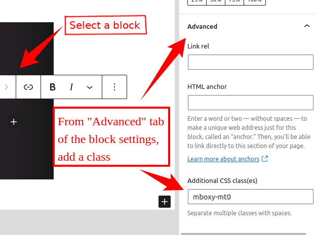
Available options:
- mboxy-mt0 – force margin top 0
- mboxy-mb0 – force margin bottom 0
- mboxy-ml0 – force margin left 0
- mboxy-mr0 – force margin right 0
Disable showing on small/large screens
Here we have classes that you can utilize over the site to hide elements for the small or large screen. Worth underlining, you can change large screen breaking point from the global settings with option Large screen breaking point. Also worth mentioning is that this is different from the option “Appear for devices” since that option is completely disabling the load for the specified device (mobile or desk), while here the individual element inside the panel can be hidden based on the screen size.
Those classes can be added to:
- regular WordPress blocks
- MaxBoxy panels – add classes option (Pro version)

Available options:
- dis-screen-small – disable for small screens
- dis-screen-large – disable for large screens
Patterns
Pre-designed templates that you can insert and edit to your needs.
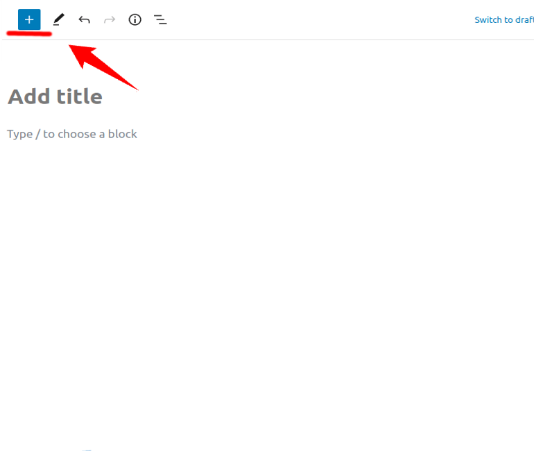
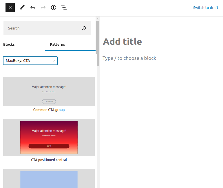
Access the patterns with the regular block inserter, just switch from the Block to the Patterns section.
With the free plugin version there are more than dozen MaxBoxy patterns added. We admit, it’s just a teaser, with the Premium version there’s much more added.
Additional functions (Pro version)
With Pro version there are few more options you can apply.
Open a panel from the content with a click/hover on an element
While setting a panel, you can determine how it’s revealing on the page. Still, here’s another way to trigger a MaxBoxy’s panel, i.e. from the page’s content either by clicking or hovering an adjusted trigger.
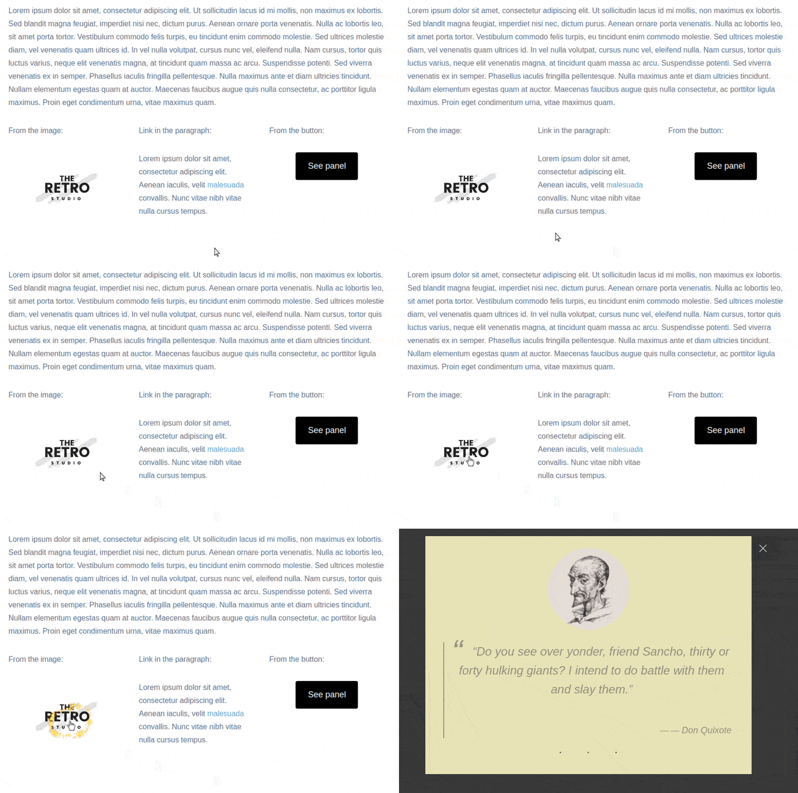
Either set it as:
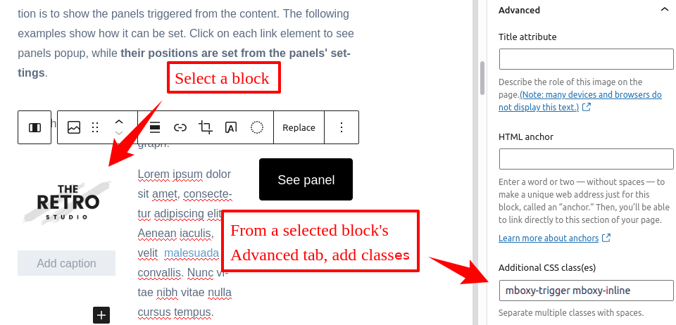
- Trigger – by adding a class “mboxy-trigger” to an element (e.g. button, link, image, menu item), which has to be clicked to open a panel
- Drifter – by adding a class “mboxy-drifter” to an element (e.g. button, link, image, menu item), which has to be hovered over to open a panel
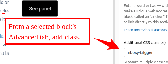
Note: Further you have to link to the particular FloatAny panel – in details explained beneath.
Option 1 – bind to the panel’s name:
- Previously, you have to publish a panel and note its name. In this example “My panel“. Make sure the panel is loading on the page, either by loading it globally over the whole site, or inserting a shortcode on the particular page (see publishing options above). Further, most likely you’ll want to set the panel role to “Hidden” so that the panel is loading on the page but it isn’t opened initially
- In page content, on a specific element (e.g. button, link, image, menu item) add a trigger class “mboxy–trigger” or “mboxy-drifter”
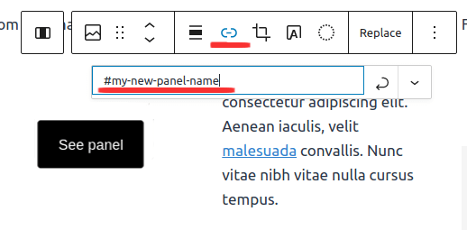
- …from the same element make a link to a panel’s id, and set it as an internal link, i.e “#my-panel” (the same as the panel was named, just replacing the space character with the hyphen)

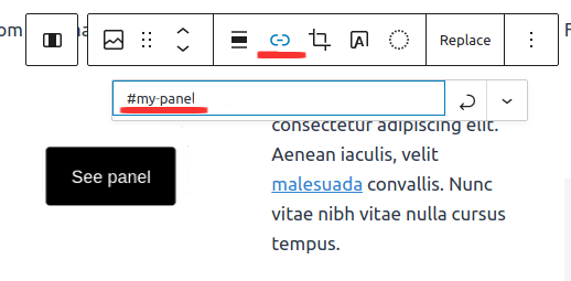
Option 2 – change the panel’s name (ID):
Alternatively, if you’re displaying a FloatAny panel through the WordPress block interface you can give it another name, i.e. ID to the panel:
- Publish the panel, but make sure to disable Site Global Loading from it’s options
- On the specific post/page through the WordPress’ block inserting interface search for the MaxBoxy and select FloatAny as the strain. Here, you’ll be presented with another option to change the panel’s default ID. Enter the name, e.g. “my new panel name”. This way the panel will be loading on this page with its new ID.

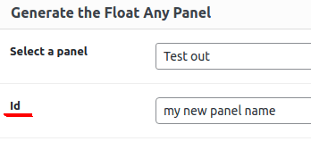
Now, do like explained at option 1, but make sure you’re linking to a new ID:

Provide coupons
In the page content, you can easily set coupon codes to be copied on the element’s click. This is the logical addition to MaxBoxy conversion panels since it’s a common usage together.
To place a coupon, just search for a “Coupon code” block from the WordPress block inserter.
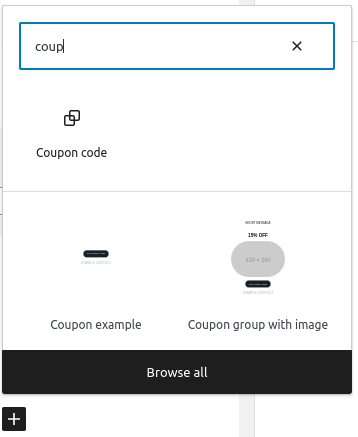
You’ll be presented with:
- Button – enter the text for visitors, e.g. “Get a coupon!”
- Text field – enter your coupon code here

Finally, on the page, visitors will be able to copy the coupon.
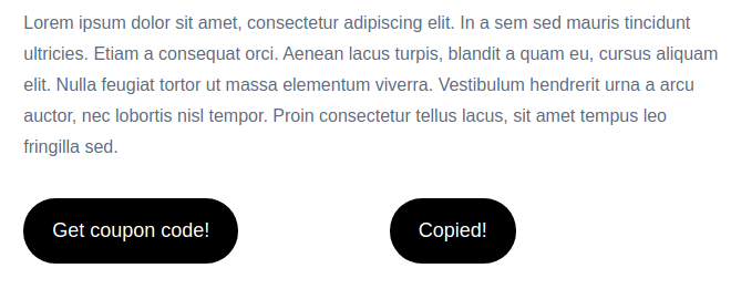
You can insert the coupon code block anywhere on the page.
Tip: Additionally you can bind a FloatAny panel and reveal additional info, i.e. once the coupon is copied panel will pop up with additional information, like “Congratulations, you’ve got the coupon! Now, go to this page and enter it to get the discount…”
Patterns
A collection of pre-designed templates that you can insert and edit to your needs.
The way to place a MaxBoxy pattern is already described within the free patterns section. With the Premium plugin version, there are much more patterns available.
Available MaxBoxy pattern sections:
- Buttons
- Contact
- Cookies & GDPR notices
- CTA (Call to actions)
- Info & warning boxes
- Media
- Promo
- Signups


